

I. Background
Outline: I. Background, II. Retail Executive Dashboard, III. E-Sign
I worked on a variety of internal products during my time at Apple, including creating a dashboard for a retail executive and redesigning our internal document signing product.
II. Retail Executive Dashboard
Previously, the Vice President of online retail, Anna Matthiasson, relied on stacks of paper delivered to her desk to analyze sales data. She wanted to replace this method with a digital dashboard for desktop. Her requirements were that she Minimal clicks to view data — no unnecessary navigation Display updated sales data with sub-second performance. Although the main stakeholder for this project was Anna, business analysts on her team would also reference this tool.
I met twice a week with the senior manager on Anna’s team, Fred, who acted as a user represent for Anna. These meetings included the project tech manager from the engineering team, Aadarsh, so that we could start preparing the technical infrastructure. Every 2.5 weeks I also met with the the business analysts on Anna’s team that would reference this tool to hear their feedback.

Online call discussing the technology and design requirements
IIa. Collaborative low-fidelity designing
Fred synthesized the paper documents and highlighted the essential data in Excel. In order to collaboratively design together online, I initially added my iterations and notes to this document, as it was the program with which Fred was most comfortable.

Original design starting point within an Excel document
After better understanding the design content and requirements, I created a low-fidelity design in Sketch so we could start visualizing the product.

low-fidelity mockup
I researched other number-heavy dashboards and shared them with the team to establish the desired look and feel for the executive dashboard. We agreed that the most successful designs had minimal muted color schemes, paralleling Anna’s request for a minimal design.
Establishing a shared vision for our design goals early on proved beneficial when presenting our mid-fidelity prototypes to Anna. As some team members grew anxious and inclined towards incorporating more elaborate visuals to make a strong impression, I reinforced our commitment to delivering a minimal layout and design. This reminder successfully realigned the team with the initial objective.


IIIa. Mid-fidelity
When consulting Anna’s team of business analysts, I discovered there might be more information to include in the dashboard. I included all of these possible categories within the first versions presented to Anna incorporated all of the possible categories we considered including so that we could get her feedback on what was most important to include, especially for the Minimum Viable Product (MVP).

Mid-fidelity design

Mid-fidelity designs
Anna evaluated the categories and narrowed the content down to the most important elements she and her team would require for the MVP. Once I had a better idea of the content required, I iterated the mid-fidelity designs to update the content.

Iterated mid-fidelity version of the design
After reducing the categories, I turned to fixing the filter selection method. Within Apple’s internal design library, there was no method of a multiple selection tool other than check boxes. However, because there were so many options in the filter, the checkboxes were overwhelming and crowded the space. Additionally, it was not user friendly to present all of these checkboxes for selection, because it would be difficult to quickly determine which options were selected.
To replace the check boxes, I created a new component to add to Apple’s internal library. I created user friendly multi-select buttons that were easier to select. This format also reduced the visual complexity.

Updated mid-fidelity version containing multi-select buttons in the filter
Once I established this component, other teams were able to use this format in their dashboard designs.

Example of using the filter bar and multi-select button component I designed
IVa. High-fidelity
Having established the content, filter and visual feel, I created high-fidelity mockups.

First high-fidelity iteration
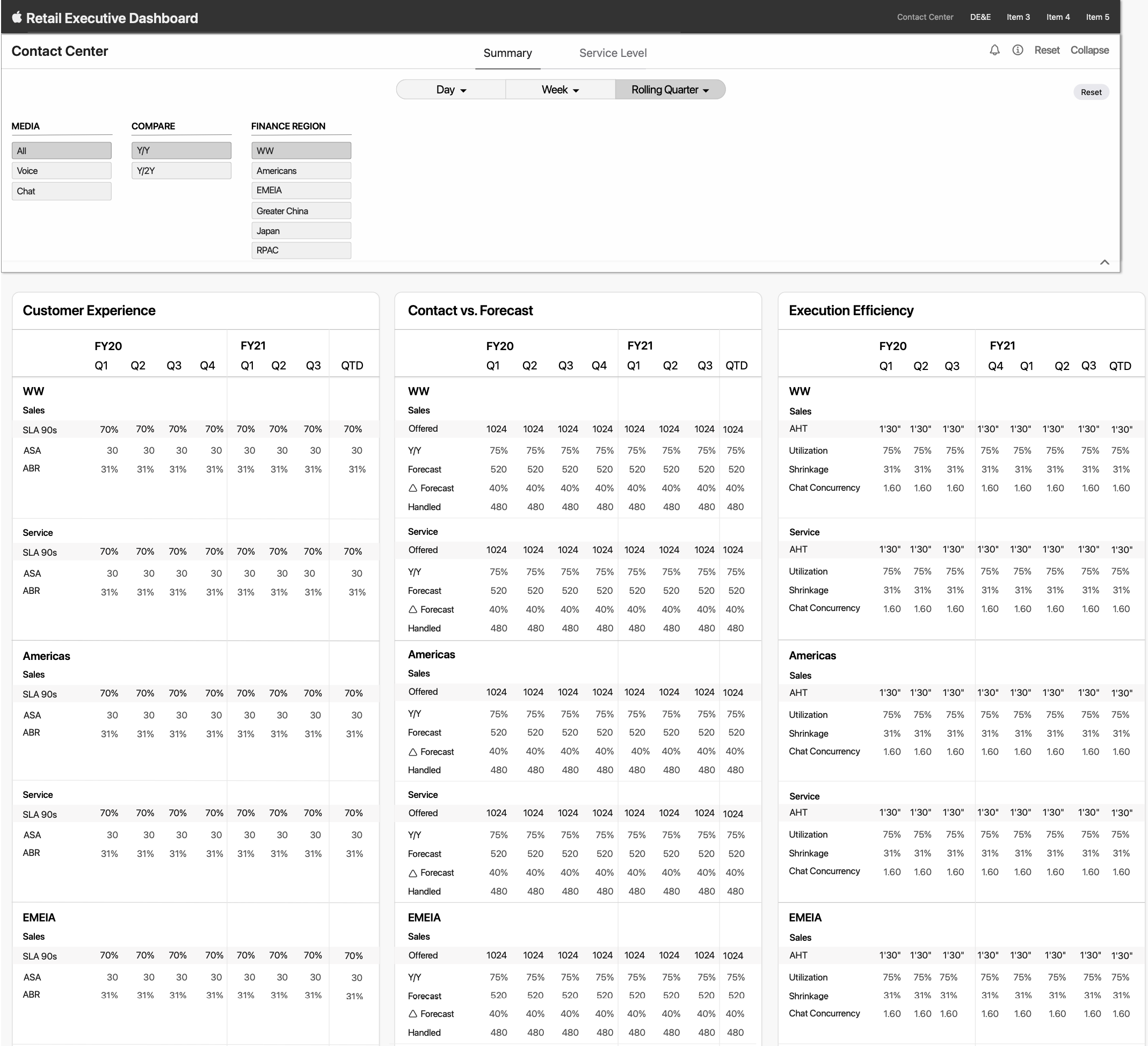
The final iteration that was approved by Anna and her business analysts is below:

Final iteration
The tech team built this design. Below is a screenshot of the working build in progress.

Working build screenshot
Anna and her team of business analysts reported that this build significantly improved their productivity, allowing them to view and analyze sales data quickly and efficiently.
III. E-Sign
eSign is an Apple internal contract management tool that facilitates the signing of documents electronically. A handful of internal Apple teams used this platform daily. I was tasked with redesigning the UI, improving the UX and designing a mobile version.
Original E-Sign design
IIIa. Research
I started the design process by first researching similar projects, such as HelloSign, Docusign and Adobe Sign. I notated their workflows to understand how similar platforms approached this design. In doing so, I noticed our content seemed more crowded than other platforms, but also kept in mind that unlike similar products, E-Sign is an internal enterprise product and our users have specific needs.

A keynote I made including screenshots of different platforms documenting user flows
In order to redesign, I wanted to first understand how current users interacted with the design. I interviewed members from different teams and also surveyed their workflows to understand how they interacted with eSign. I discovered some features such as saved search were never used. Users also did not need all the information offered in the table displayed. I also noticed the hierarchy of information seemed a bit unintuitive because the page category selector was in the top bar, when it should have been on the page directly. Also the search bar was small and hiding in the right corner and the sign button appeared disabled.
IIIb. Designs
I created 2 design versions. In both versions, I modified the filter and created a clearer hierarchy between page label, search bar and table.
Version 1: The first was a condensed design based on user interviews and discussions with stakeholders. I eliminated table elements, condensed the side bar, and changed the styling. I also changed the sidebar. In the original sidebar, the same information is listed twice but in two different categories: My Contracts and Admin View. I created a tab view between these 2 categories so that the information is once, saving space in the side bar for the advanced search.

Original side bar

Version 1 redesign

Version 1
Version 2: In the second design, I kept all original columns in a scrolling table. I included all the previous e-Sign columns that I eliminated in Version 1, because I felt that we needed more user testing to establish what is most desired by our users. In order to make this decision, I wanted to increase my research sample, as there were many different users interacting with e-Sign, and I was only been able to interview one member from each team. Because this version was more content-heavy, I used different components than in version 1.
Unlike version 1, I kept the original sidebar in version 2. This is because we had more columns in this version, so we needed to have as much real estate in this panel as possible to display this information.

Version 2
Upon expanding the user base I interviewed, I noticed that different team members gave different answers on the information they felt necessary to include. In order to avoid removing essential information, I advocated to the e-Sign stakeholders that we should choose version 2. This decision was approved by management, and my design was transferred to the production stage.
IIIb. Mobile version
I also created a mobile version for e-Sign. Since the web version is packed with data, I decided to simplify the app into the main tasks users would want to accomplish — viewing their document inbox. In each category I include a highlight of the most important information, such as date, location, team, etc. I also include a sign button, and an option to view more details.
As one of the few internal UX designers, I was transferred to help another team with their project. Below are my Mid-fi ideations of the app content and flow.


